German Motors
Background
German Motors was opened in 1961 by my grandfather and his brother. Since then, German Motors has existed to serve the local community by maintaining and repairing German cars.
Back in 2012, I helped to update and add liveliness to the companies branding. In 2021, after 60 years in business, it was time to revisit and freshen things up again.
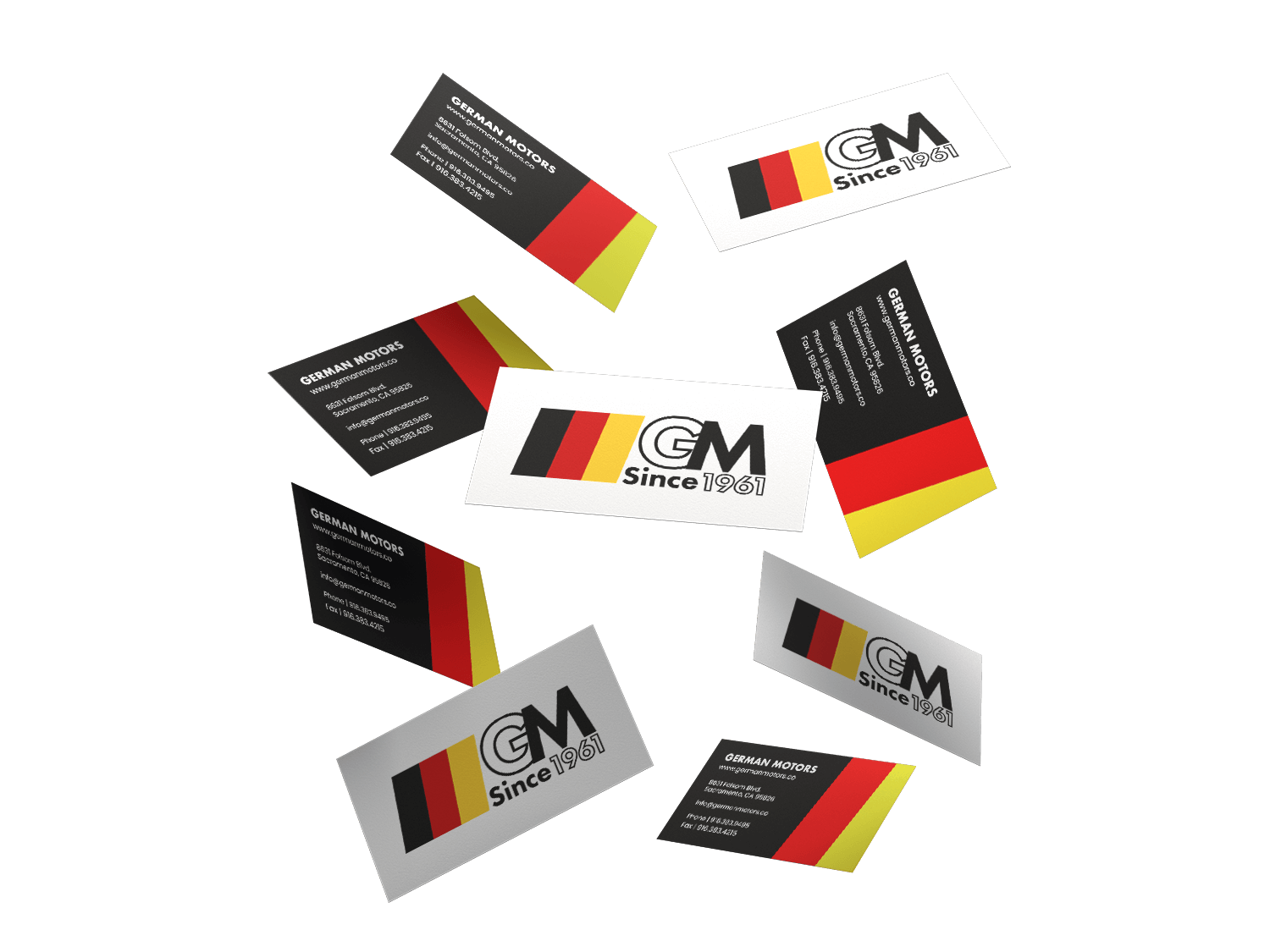
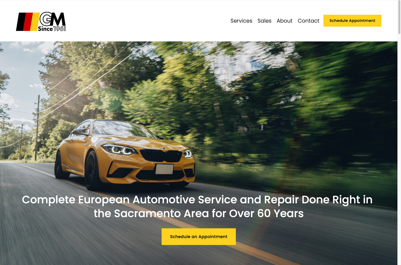
To celebrate over 60 years in business, it was time to refresh the German Motors branding and build a new, more modern website.
The Logo Refresh
The New Logo
The Old Logo
Major Changes
Removal of the Gradients
New Font – Futura
Adjusted the Overlapping Letters
New Layout
Corrected Overall Alignment
Overall, the old logo has withstood the test of time. However, there is always room for improvement.
First off, I wanted to simply refresh the logo, not completely redesign it. That meant keeping a good portion of the old elements.
The part that dated the logo the most (and made it difficult to use in certain scenarios such as signage) was the gradient on the “G” and ”M.” So those had to go.
The overlap of the two letters was also hard to read, therefore they were separated to make them more legible. Futura was chosen as the typeface to maintain the modern aesthetic while also having a mid-century feel.
For fun, a variant for the 60th anniversary! (Diamond Anniversary)
The New Website
German Motors’ old website was built several years ago in WordPress. Though it looked “OK” for the era it was built, it was in need of revamp and simplification. The website was quite cluttered and function well on mobile devices.
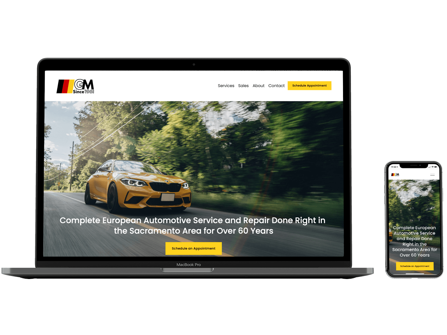
With that in mind, I built the new website to be focused, clear, and understandable. The owner‘s goal was for clients to know they’d found the right place and be able to make an appointment as painlessly as possible.
New Website
Clean
Clear
Concise
Responsive and Looks Great on Mobile
Old Website
Confusing
Cramped
Information Overload
Not Very Attractive on Mobile
Mobile Optimized
Templates? Never
Each page got its own unique design custom tailored to it’s content. The same design elements are applied throughout in order to provide a cohesive feel across the website.
Are you ready for a modern website that’s user friendly, easy to update, and sets you apart? Let’s make it happen!
